Well & Lighthouse
Branding & Identity / Web Design / Icon Design
Overview
Well & Lighthouse is a digital marketing agency that specializes in progressive politics. When I began my tenure at the company, I was tasked with developing new branding for the firm. This include a primary visual identity for the agency as a whole, as well as somewhat separate but complementary branding for our digital marketing platform, Compass.
Logo
Competitive research revealed several commonalities among competitors’ branding: color palettes dominated by bright, democratic blues; sans-serif typography (often Obama's Gotham typeface); and a startling amount of other nautical themes.
The firm’s old logo featured a small image of a lighthouse on the left and the company name to the right. For the brand refresh, I wanted to move away from any literal depictions of lighthouses to a more typography-based solution in order to keep the new logo from feeling too cliched or derivative and to avoid any similarities with competitors.

The old logo used Garamond. I wanted to use a serif typeface to make the firm feel more reputable, established, and distinct among its peers, so I chose Hoefler Text, which has similar proportions but a more modern feel. I chose Whitney as the sans-serif complement for the tagline and as the primary font for the rest of the firm’s collateral.


The choice of dark tones for the firm’s primary color palette were meant to contrast with the light component in the logo’s gradient, impart a sense of depth and richness to the brand, and to help distinguish ourselves from the vast sea of ceruleans and cyans that dominate the rest of the industry.
Website
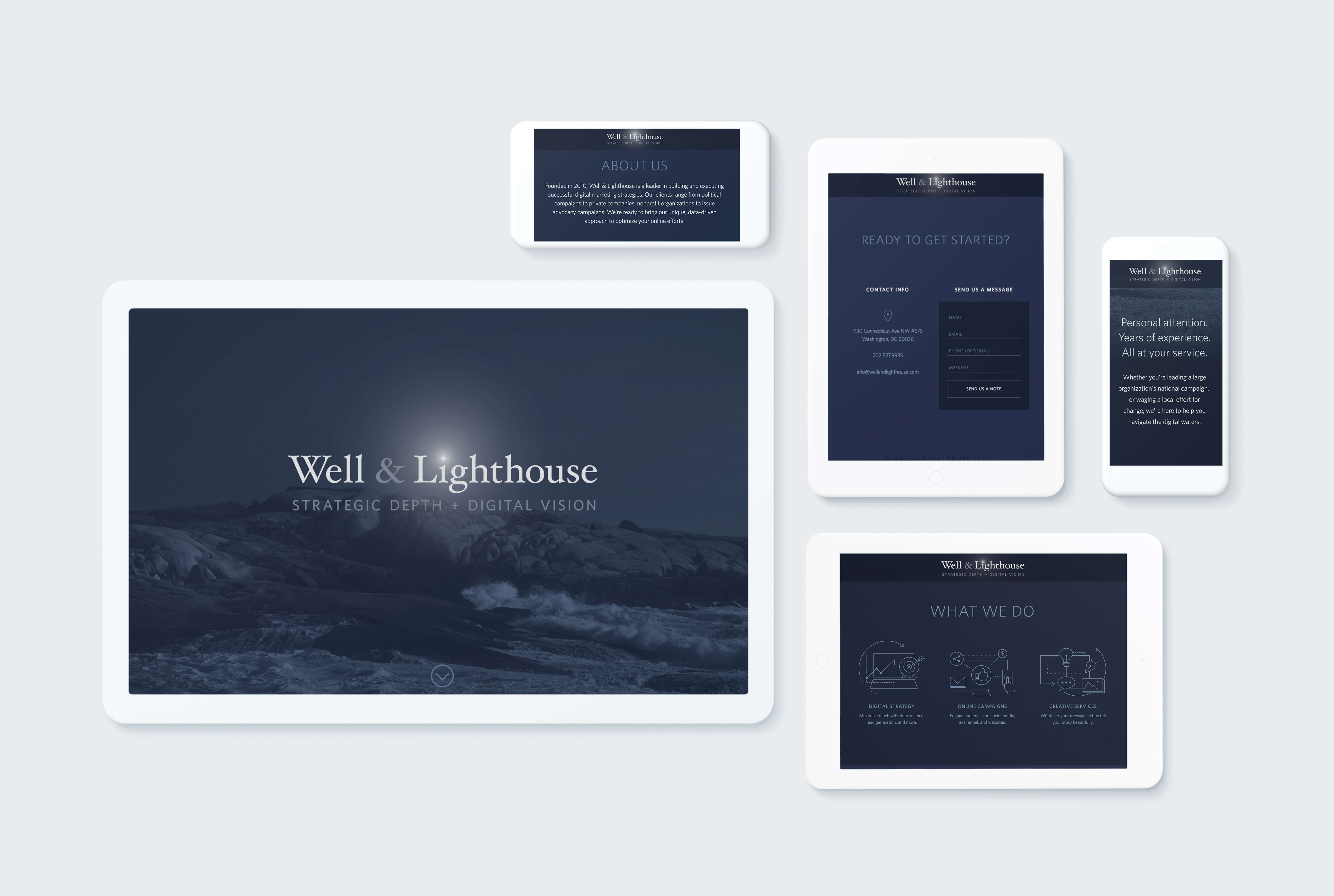
For the website, I wanted the new logo to take full advantage of the firm’s digital nature. The white gradient over the i on a dark background is best suited in a digital space. The logo’s “glow” lent itself to subtle CSS animation, which we incorporated in the site's main hero area (and which can also be seen at the top of this page).

Compass Logo
In addition to our primary logo, I was also tasked with developing a logo for our digital marketing data integration platform, Compass.

The inspiration for the logo came from old promotional copy I found stating, “In the old days, sailors used to use the stars as guides on their course.... we invented compass to navigate the digital waters." The arrow depicts a traditional compass while the dots allude to both constellations and data points.
Icon Set & Illustrations
I also created a full suite of custom icons and illustrations using the same visual language for use on our website and in several places in Compass.


